Color psychology in UX & UI - why are certain shades of blue joyful and others depressing?
Psychology researches the influence of combinations of colors on the user. Every color has a different meaning and affects the human brain in a particular way. Therefore it is worth using the color meanings in a certain way to utilize them as efficiently as possible. How to use the best of them while designing websites and user Interfaces?
Website color palettes - make a flawless first impression
There is a common belief that the first impression stays with us for a long time. Sometimes, it may even last forever. First impressions are essential regarding the website and application UX design. A potential user may feel discouraged by our product. As a result, the individual may not be eager to use our application, even after implementing improvements.
Sight is the sense that influences most of our interfaces’ perceptions. It is responsible for recognizing as much as 87% of information reaching us from the world outside. To compare, the rest of the senses may collect only 13% of the site’s content. Also, while browsing an app or a website, people rely on the minimal usage of their senses. That is why it is so significant to remember how the color emotion affects the user's mind and choices.
Color psychology in marketing - what does a choice of a particular color say about your brand
Specific colors often correspond with their equivalent in nature. Throughout the evolution process, human brains used to rely on this trait to recognize threats and find food. That is why every color may have both positive and negative connotations. For example, red, orange, and yellow can be associated with energy and enthusiasm on the one hand, but also danger and threat. There are many more instances like this. What do specific colors mean? How can they affect the user experience?
White, black, and greyscale - base elements of the app and website design
The crucial element of every website’s UX design is its intuitiveness and clarity. Designers choose the background color to facilitate navigation through the options and functionalities. A well-suited background color palette also influences individual users’ experiences.
White - safe option for the background choice
The white color is associated with minimalism, clarity, and honesty. It is the primary color of many brands, for example, Apple and Wikipedia. UX design often uses white as a background that provides clarity and good visibility of every interface element.
Designers often combine white and off-white shades with light grays. This delicate color palette constitutes a popular means for the background color of the app or website’s design.
Black - a luxury that should not be overused
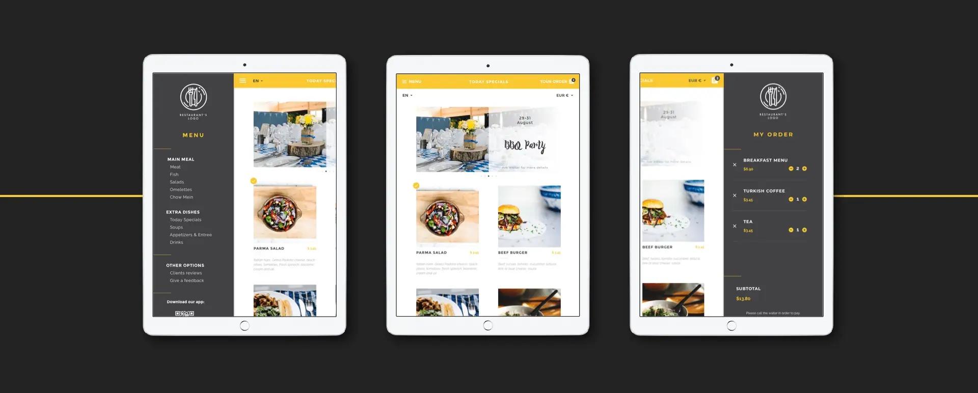
The black color means professionalism, prestige, and seriousness. It works perfectly as a base for a brand offering luxurious goods. App and website design based on black color may bring attention to the product. It may also emphasize its luxury and attract attention to the product’s details. See how we used the black color as an element of the background in our application Pulse Menu.
On the other hand, improper use of black may create a dark and unfriendly interface.
Color palettes may affect user subconsciousness. Nowadays, however, the choice between black and white is based on practical reasons. For example, the possibility to use the “dark/night mode” is often highly valued by users.
Red, yellow, and orange – their influence on user experience
These colors affect certain types of emotions. Emotions may directly increase the probability of taking a particular action. Red, yellow, and orange increase carving and motivate to take a spontaneous activity, such as purchasing a specific product or signing up for a newsletter.
Red - the crucial element of every color palette
The red color means strength, passion, and excitement. It is the most intense of all the colors. Therefore, UX designers should use it carefully. Reds strongly affect not only emotions but may also influence physiological reactions, including creating excitement or even causing hunger. Such stimula may result in a strong desire to buy a product. For this reason, plenty of brands in the creative industry rely on red: for example, Netflix and Canon. Medicine (Colgate) and the clothing industry (H&M) use its shades.
While designing a website’s interface, it is worth remembering that red is not the best choice as a background color. If the purpose of implementing red icons is to make them visible, they will need a proper amount of more toned-down background. Otherwise, the interface will be illegible or unpleasant.
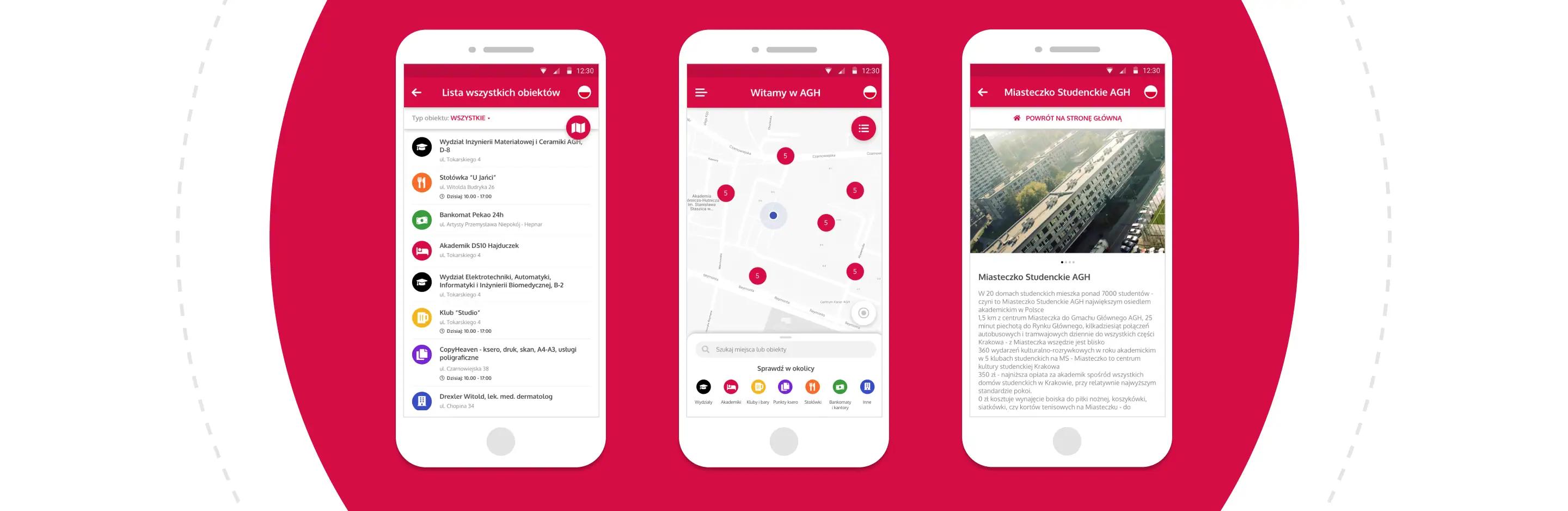
This is how we designed the interface of the mobile university app Welcome to AGH. Red, green and black are the traditional university’s colors. We have decided to incorporate them in our project in such a way, to utilize their functional aspects in UX and UI design.
The interface consists of seven main colors. Apart from the traditional AGH colors, during the designing process we have decided to incorporate orange, yellow, purple and blue. The background of the university mobile application is based on whites and light shades of gray. These choices made it possible to utilize both functional and the esthetical aspects of the University’s colors.

Orange - much more than just a Call to Action
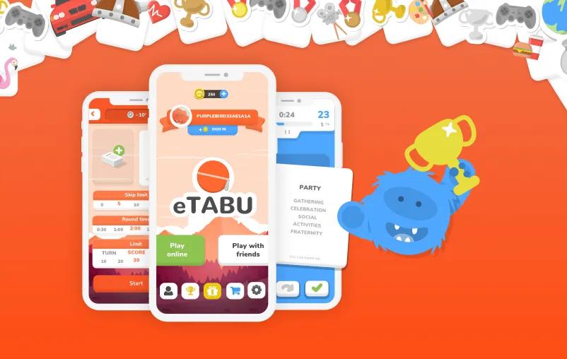
The orange is associated with enthusiasm, confidence, and professionalism. It may motivate users to perform certain activities. That is why orange should underline the most important elements of the user interface. Online shopping platforms often use it. We used orange as a vibrant background color in eTABU - our mobile app, which allows you to play an entertaining party game just with your smartphone!
Yellow – from joy to warning
In the color psychology, yellow means joy, energy, and professionalism. Many areas of marketing rely on this color. We can run across the usage of yellow in the case of brands associated with creativity, such as Nikon and Snapchat. McDonald's and Subway also make use of it.
Yellow may also be associated with threat and danger. Warning signs use this color to signalize a potential danger. Therefore, it shouldn’t be overused. You can make good use of yellow accompanied by blue shades as a connection of professionalism and trust.
Blue and green – peace and harmony
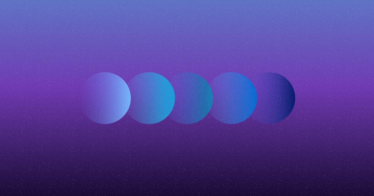
From baby blue to indigo
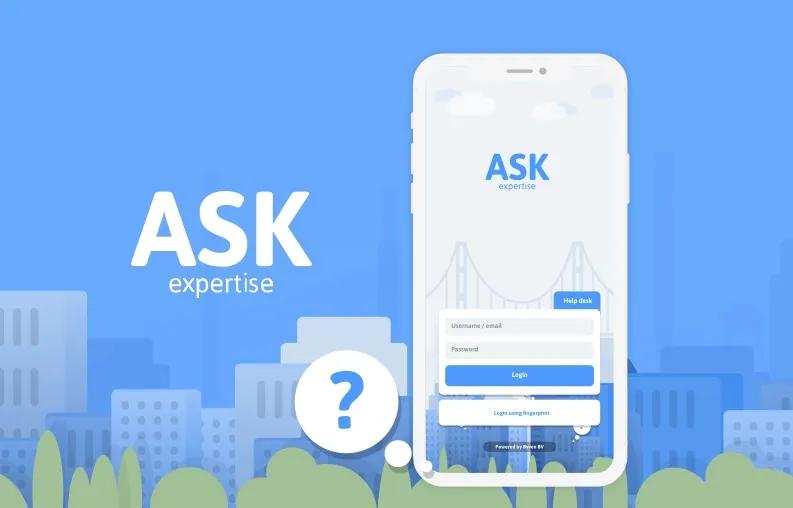
The blue color is one of the most willingly used in the technological industry. If chosen properly, it may increase the level of trust and bring calm. However, its darker hues may be depressing. Lighter shades of blue may increase focus. They are perfect for designing an interface dedicated to transferring knowledge and looking for information. That is why we decided to incorporate it as the main color in ASK Expertise. This application was created for communicating with experts and searching for information about mental health.
Green - growth or stagnation?
Green is associated mainly with nature. It improves the mood and means freshness and growth on the one hand, but also safety, balance, and calm. Therefore, it can be energizing but if overused, may cause the feeling of stagnation, weakness, and a lack of energy. Starbucks knowingly uses its darker hues as a combination of luxury and calm. In a more dynamic version, we associate green with active brands aiming at discovering the world, such as Spotify, Nvidia, and John Deere.
Pink and violet – from “Barbie” theme to a space flight
Pink – not only for the younger generation
We associate pink with dedication and honesty. However, it often brings to mind toys for children. It is bright and hard to overlook. On the other hand, if properly used, pink may seem elegant and professional.
Violet – background color of websites for ambitious people
We associate violet with a less earthbound and literal perception of the world. The general perception of this color is relaxing or dreamy. On the other hand, it has the potential to be inspirational and encourage to discover the unknown. By those means, violet has found its use in the Twitch (a streaming platform for gamers) design.
Color Psychology in UX design
Color psychology provides enough information to develop and create a perfect user interface. This, however, is only the tip of the iceberg. There is much more to do as a UX designer. They have plenty of complicated problems to solve, and the most appropriate solutions often are not the most intuitive.
If you are interested in the topic of application design, check also Flutter Design - libraries. And if you are planning to implement User Experience solutions in your application projects, be sure to check out our offer.
Share this post:

Stay updated with new posts
Get notifications when new articles are posted. You can always unsubscribe from the list.
Softnauts is committed to processing the above information. Read Privacy Policy


