How to: E-commerce website redesign
An existing website redesign followed by thousands of active visitors is always a challenging (and exciting!) project for designers. In the following article, we would like to present our design approach to redesigning one of the most popular online classified advertisement websites in Poland - Gumtree.
Hundreds and thousands of users enter Gumtree when they require any service or activity. Since Gumtree launched in Poland in 2004, the Polish website has not introduced a massive redesign yet. That is why we decided to try it at Softnauts! Check out this article and see by what means we have managed to improve that popular website.
1. Website redesign - understanding its performance & current users
During the discovery phase, we aim to recognize the overall look, website goals, and its most valuable pages. We ask ourselves “3-W” questions:
- Who is visiting the company?
- Why is he doing that?
- What pages does he need in the first place to achieve his goal?
The “3-W” questions are an essential part of our strategy. They enable us to prepare a substantial foundation for further solutions. Defining the primary aims of each project has a strong influence on almost every aspect of the project. That may include function implementation or future marketing strategy and the general branding of the company.
According to a Google case study, there are four typical user motives:
- ‘I want to know’,
- ‘I want to go’,
- ‘I want to do’,
- ‘I want to buy’.
First, we analyze the current website performance, online positioning, targeting, and mission statements. The next step is performing the essential UX research practices, such as usability testing, competitor analysis, and target audience research. We interview users, as well as read online comments and page reviews. These activities bring us closer to understanding how to achieve and elevate customer satisfaction.
The outcome of this phase is a new content, architecture, and marketing website strategy. As you can see, the first step is essential to the project’s further development. That is why we place a particular focus on this phase.
With the Gumtree website redesign, we have analyzed most of these factors, talked to unique frequent page users, and researched Gumtree’s social media and online customer opinions. We learned that some users (especially younger ones) think the design is a little outdated, so they sometimes choose competitive websites such as OLX. They find filters hard to use; the users get lost in numerous categories. A general aim of our redesign serves to fulfill their wish for more intuitive navigation, and a more modern overall look and feel of the website.
2. Website redesign - brainstorming & mood-boarding
As a design team, we strive to bring our redesign visions together. At this point, we try to rejuvenate and modernize the overall look and feel of the website, work on logo redesign, fonts, and style propositions and build the base for the future new design system. As designers, we usually use inspiration boards and socials, such as Dribbble or Pinterest. The specific color schemes are also worth keeping in mind, as they can have various interpretations in different countries.
Brainstorming is a technique on which the designer community often relies. A good brainstorming session is a source of spontaneous, creative ideas. It is also a potent ground for an uninterrupted train thought process, which may lead to surprisingly lateral results. By utilizing this technique into our workflow, we consider each idea thoroughly. That allows us to critically look at the predefined problems and their potential solutions.
3. UX Design improvements
In regards to website redesign, E-commerce is a fairly specific category of websites, where UX design practices need to be focused directly on shoppers, often of all ages. Information architecture must be intuitive, products should be listed clearly (and open in a new tab), and pages can’t be too overloaded.
On the current Gumtree website, we specified five main areas for usability improvements:
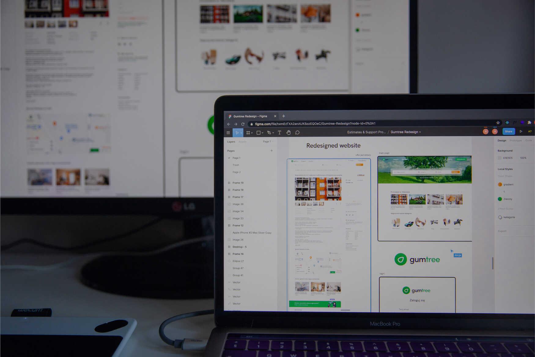
- The homepage needs to focus more on the search process - which is why we put a search bar in the center of the screen, along with an eye-catching tree image.
- Reviewed categories - some of the existing categories have extremely fewer ads active, such as Boats and Water Vehicles, or Health and Beauty. These categories can be gathered together as the Other category. There shouldn’t be more than ten main categories.
- Redesign the form of ad posting - we made it more clear, however, we wanted to leave most of the current functionalities. We put more emphasis on the price and the pictures of the posted advertisement. We prioritized the content and added a map feature underneath.
- Redesigned filters - currently, while searching for an apartment, users cannot choose multiple options (i.e. 2- and 3-room apartments) at the same moment, which is confusing and time-consuming. Filters are also dependent on the category - some of them need enlargement and some only have small amendments for usability testing.
Uptaking these four steps ensure that the website redesign will be aesthetically pleasing. Its functionality will also improve, leading to a more satisfying user experience. Such solutions oftentimes will simplify the general website structure. But, as we can see with Gumtree, sometimes less is more.
4. UI Design changes
The changes implemented in the UI design are the foundations of the website redesign and its successful redevelopment. We make our final decisions after the UX amendments stage while considering user feedback from the discovery and research phase.
For Gumtree, we minimized the branding visuals - especially the logo graphics, replacing them with a more simple icon. It was vital for us to maintain the tree annotations - remembering that name is taken from the local Australian phrase for the Eucalyptus tree. We chose a more vibrant and modern shade of green, as we have acknowledged that users tend to associate the Gumtree brand with green - and have grown to like this color palette. With that in mind, we have also emphasized the word “tree” by coloring it green.
Professional modern websites utilize color palettes in accordance with the latest trends (see Pantone Color of the Year selection), as well as research-based assumptions regarding the psychology of color. To see how particular shades can influence your mood or view on certain brands, check out our article on this matter.
5. Website redesign - User testing
After the prolonged preparation, we have now achieved the prototype phase. The product now includes key functionalities, allowing us to release the newly-designed website for user testing.
Now, the answers to our questions will come to fruition. Have our ideas found any basis in reality? Do they solve any of the pre-defined problems? By enabling testing on a target audience, we can support the results with data to produce comprehensive results that reflect the application's actual status.
For the site tests to be fully authoritative, they should also consider the mobile and tablet versions. The audience using these device formats is usually a fairly high percentage of the total. Their comfort of use is also not insignificant, which will allow us to release a well-rounded appliaction.
Website content needs to be built in terms of SEO optimization. Also, this time we have tried to combine insights from different sources, to make the best discovery of this potential solution.
Gumtree website redesign - Conclusion
We have taken up the Gumtree website redesign as a way to present our workflow. To the most critical aspects of this process, we can include:
- Defining the need,
- Brainstorming,
- Specifying the areas for UX improvements,
- Changes in the UI design
- Testing the prototype.
All in all, that experiment has resulted in a resounding success! The new website redesign is more intuitive and aesthetically pleasing. It also delivers its functionality in a way that improves the overall user experience.
If you are interested in our Gumtree redesign process, please check out our new Behance post with more details on redesigned screens.
Want to base your website on a factual, careful prototype? Rely on Softnauts' expertise - we offer services such as:
Share this post:

Stay updated with new posts
Get notifications when new articles are posted. You can always unsubscribe from the list.
Softnauts is committed to processing the above information. Read Privacy Policy

