Responsive Flutter application - how to implement?
Today's market requirements have meant that modern applications must feature responsiveness - the ability to adapt their interface to the device’s dimensions. Responsiveness in mobile applications deserves special attention - because a growing number of users are using these devices. Flutter’s latest version allows you to efficiently make settings that will make your application look good on virtually any device.
Flutter application and mobile app responsiveness
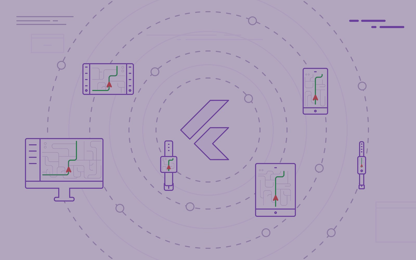
With the 2.0 version of Flutter - announcing possible app compatibility with mobile, tablet, web, smartwatches, and even car displays - it is necessary to understand the incredible power of responsive applications. But what does it mean?
Its code must respond to various layout changes for an application to be responsive. Its UI should act according to the shape and size of the device that displays your application.
Flutter is a framework that focuses on developing great-looking applications on the device. However, it can be challenging due to responsiveness. The latter demands implementation alongside all those screens with different widths and heights. Thankfully, the Flutter team and community developed a few solutions to speed up the process.
How has Flutter improved the responsiveness of mobile applications?
There are significant differences in handling responsiveness on Android and iOs platforms. Let's now focus on it - to understand their essence and how Flutter governs mobile app responsiveness.
A responsive application - Android
In Android’s case, displaying multiple UI views on a screen is possible due to Fragments. We can define them as reusable components you can launch inside an app Activity.
There is also a rule worth remembering. You can run several Fragments inside an Activity. However, multiple Activities cannot be active within an app simultaneously.
The responsiveness in mobile applications - iOS
In iOS, UISplitViewController plays a similar role. It manages child view controllers in a hierarchical order within the interface, and - consequently - enables you to control multiple view controllers.
A responsive application - Flutter
Flutter introduced the idea of widgets. Imagine them as building blocks that can be interconnected to create an entire application.
This depiction is key to understanding how Flutter helps in designing cross-platform applications. This platform reads each screen and application as a set of widgets.
The resulting advantage is also that Widgets are inherently reusable. That equals no need to learn any other concepts when building responsive layouts in Flutter. That feature is why Flutter applications are a game-changer in today’s mobile app development.
Responsive applications with Flutter - the basics
There are two basic approaches to creating responsive Flutter applications. Let us now dwell on this topic to grasp the elementary understanding of this process.
MediaQuery.of()
MediaQuery is a sustainable method to get information about the device’s size and end-user preferences. We use it to design the app’s layout according to both of these aspects - so that the design meets the requirements and makes the application responsive.
This method is responsible for giving the size of the screen, its orientation, etc. In short, it rebuilds the app whenever the user changes the screen size, allowing the display to work accordingly to set preferences. It is worth using when you need to work on the whole application’s context. That does not include the size of a particular widget.
LayoutBuilder
Let’s now get acquainted with another class that you will find helpful while creating Flutter responsive applications. LayoutBuilder facilitates the creation of a widget tree depending on the size of the original widget.
This class helps you to:
- know how big your widget is going to be,
- decide how you are going to display it depending on its size.
LayoutBuilder utilizes two main parameters, that is:
- BuildContext,
- BoxConstraint.
Both types of measurements have different various uses. We consider BoxConstraint to be more important than the two, as it defines the width of the parent widget. That serves to constitute the child according to the parent’s size - whereas, BuildContext just refers to a particular widget.
The main difference between Media Query and Layout Builder is that the former uses the full context of the designed screen. By contrast, Layout Builder can define the maximum dimensions of each widget.
Responsive Flutter app - advanced options
Both MediaQuery and LayoutBuilder are significantly helpful in creating a responsive application design. However, there are more options for responsiveness that are worth mentioning. Let us now have a glance at them.
AspectRatio
This loosely fitted widget scales its child into a specific width-to-height ratio. Thanks to that, it retains similar space even on different screen sizes.
Let us now dwell a little about this widget. First, the widget checks out the largest width within the defined layout constraints. The widget’s height constitutes the given aspect ratio to the width, which is co-dependable as a ratio of width to height.
CustomSingleChildLayout
This widget determines the layout of the child by using a delegate. It is a special class that uses functions such as shouldRelayout() or getSize() to position and resize a child widget. It determines the proper parent's size and constraints to position the child.
However, have in mind that the child’s size cannot define the parent’s size. Preserving the widget hierarchy for this solution is essential.
CustomMultiChildLayout
This widget is a more complex version of its predecessor - CustomSingleChildLayout. It takes a delegate responsible for all the magical positioning and sizing, and a list of children to become positioned. It also determines constraints for all of the children and their relationships. The Google team advises using CustomSingleChildLayout or Stack in simple cases, as they lack the complexity of this widget.
OrientationBuilder
Sometimes, the app’s display may be distorted while the user rotates the screen. The proportions between landscape and portrait modes are significantly different - which doesn't mean that our application has to look bad! In this case, the Orientation Builder comes to our aid. This class builds a widget tree that depends only on the parent widget’s orientation.
FractionallySizedBox
This widget sizes its child based on the specific fraction of the display with which it is being provided.
FittedBox
This widget is used solely for boxes, as it fits the item into its parent box based on given constraints. Thanks to that, fitting images or videos is no longer problematic and does not require manually calculating the exact width and height of the child widget.
Responsive Flutter application - the community way
There is also another option to have responsive apps without loads of additional code and specific widgets that can take up a lot of lines. Flutter’s potent community created a few packages to help us with that problem. Moreover, they come in handy while keeping our code neat and clean. The only downside is that these solutions are less flexible and customizable, thus not suited for every responsiveness issue.
Adjustable mobile app - Responsive Framework
The main catchphrase of this plugin is “Responsiveness made simple”. For sure, it delivers as promised! It automates the scaling and resizing process to keep your UI neat and clean - no matter what device it is on. You only have to set breaking points, so the plugin knows where and how to act. Between every breakpoint, you can choose if you want to resize or autoscale your application interface - giving you more control over your design.
Check out this plugin here: https://pub.dev/packages/responsive_framework
Flutter ScreenUtils
This plugin allows you to adapt screen and font size, automatically matching it to different devices. You only have to provide it with the default screen size you have been working on and then add .w (stands for width) and .h (stands for height) properties to each dimension used in the application. This easy trick will leave you with a responsive UI regardless of the device’s size.
Get accustomed to this plugin and download it from this site: https://pub.dev/packages/flutter_screenutil
Responsive Flutter application - are you ready to develop one?
All of the provided solutions make our daily work with Flutter a comfortable, swift experience that allows implementing suitable solutions that will make your application responsive - no matter the device at which it is installed.
Do you want to know more about Flutter? Check out our blog entries regarding this amazing platform.
Developing cross-platform Flutter applications is our daily bread. Find out how you can back up your business with us!
Share this post:

Stay updated with new posts
Get notifications when new articles are posted. You can always unsubscribe from the list.
Softnauts is committed to processing the above information. Read Privacy Policy


